Edit : I took time to improve this site. It now works fine without JavaScript and has been ported to Jekyll. Also both Sass and JavaScript code have been improved.
Hey people! I recently had the opportunity to work on a cool little project I’d like to talk about: an advanced image gallery with some really cool features. Indeed, I’ve been asked to design and develop the site of Alix Lucas to promote her work as a French photographer. Since I’m a big fan of her work, I accepted and it turned out to be quite fun to work on this project.
Let’s say things straight: I’d never have the opportunity to work on an image gallery before. Actually I did but back then I didn’t give a shit about performance, responsive design, high-density displays and all the topics cool kids always talk about. So this time I’ve been faced with some difficulties I had not encountered before; meaning I had to solve them by myself.
Working on the layout
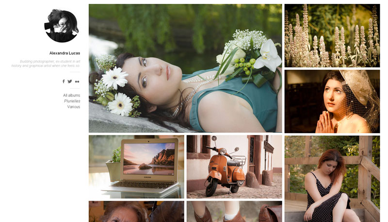
The main content of the site is photographs. The goal is to show them. Alix wanted something “Flickr-like”. Some sort of wall of photos that automagically adapt to the size of your screen. Kind of a cool layout, really.
At first I thought about doing it myself and then…

It would have been a pain in the ass to work out such a “complicated” layout so I thought about Masonry but that’s kind of old school, right? In the end, I went with Isotope for layouting the items.
Isotope has to be the best JavaScript plugin I ever worked with. Developed by David Desandro, you can think of it as Masonry 2.0. It makes complicated box-based layouts fully customizable and above all easy.
The idea is quite simple: you define a container that will draw boundaries for the layout and Isotope will move all its child elements according to the available room.
$container.isotope({
  itemSelector: '.gallery__item',
  masonry: {
    columnWidth: 410
  }
})
What is really nice is it takes advantage of hardware accelerated CSS transforms (essentially translate) if the browser support them (else it falls back on regular TRBL offsets).
Anyway, I wanted to give some emphasis to the author content: her picture and her name, a short description and one or two ways to contact her. I first tried to include this as if it was another block in the layout, but it looked kind of crowded. Instead, I decided to go with a fixed column. Not only does it make this content more valuable but it also gives the page the space it needs to look nice.
Meanwhile the pictures are all wrapped in a regular unordered list which has a huge left margin (to bypass the fixed sidebar).
<li class="gallery__item">
  <img
    class="gallery__image"
    src="images/filename.jpg"
    alt="Alt text"
    width="400"
    height="266"
  />
</li>
Building features over the layout
We needed two major features for this image gallery:
- being able to filter images by tags to manage albums
- display a scaled up image when clicking it
The first one was pretty easy to do since Isotope comes with a built-in way to filter and sort items. In the documentation, they recommand using a class as a tag and apply it to all elements you want to assign this tag to. Then you create a little list with a jQuery selector as a data-filter attribute (like .tag). When you click on an element of this list, the plugin parses this data-attribute and displays nothing but the items matching the given selector.
I didn’t want to add classes for this so I added a data-album attribute to every item and passed it the name of the album the image belongs to. Then, I give something like this to the data-filter attribute of the filter list: [data-album\*='album-name'] (literally everything with a data-album attribute containing 'album-name'). Easy peasy!
Regarding the second feature, I basically needed a little lightbox thingie to display an image in fullsize when clicked. I could have made one but since I am definitely not a JavaScript ninja, I would probably have ended with a code that could be improved. So I decided to rely on a built-in solution; I wanted something which is both nice and efficient so I went with Avgrund from Hakim El Hattab.
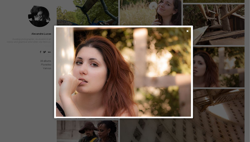
Avgrund is a very lightweight modal plugin that does exactly what I want: open a modal on click, close it with a close button or the ESC key or clicking out of the lightbox.
Adding some fanciness
One thing I wanted to do is to progressively display the pictures when loading the page: the first one being immediately displayed, then after a quick instant the second one, then the third, and so on until all images have been displayed. It’s definitely not a key feature, just eye sugar.
Isn’t it the perfect usecase for CSS animations? Let’s jump on this opportunity, it’s not that often we can safely use CSS animations. First the (really common) @keyframes:
@keyframes opacity {
  from {
    opacity: 0;
  }
  to {
    opacity: 1;
  }
}
Now all I had to do was applying it to all items with a varying delay. The highest the index of the item in the list, the longest the delay. Perfect! Let’s loop! But wait… I don’t know the number of images in the page. I guess I could have gone to something like 100 to be sure it works everywhere but that would have bloated the CSS. Plus, I realized 20 is more than enough for most screens (including my 29").
@for $i from 1 through 20 {
  .gallery__item {
    opacity: 0;
    animation: opacity 0.25s forwards;
  }

  .gallery__item:nth-of-type(#{$i}) {
    animation-delay: $i * 0.1s;
  }
}
Basically, I assigned opacity: 0 to all items so they don’t appear at first. Then all of them appear in about 250ms except the 20 first for which the animation is slightly delayed according to their index in the list. The only thing left to do was wrapping this into a Modernizr class (.cssanimations) to be sure elements are not set to opacity: 0 on unsupported browsers.
Doing something for small devices
Of course, we wanted the site to look acceptable (if not good!) on small devices. I wasn’t sure about the way to display this photo gallery on mobile so I opted for the easy solution: put everything into one column. I’ll try to think of something better for a future version.
Thankfully, Isotope handled most of the work for me: when there is no more room for two columns, it wraps everything into a single one. I only had to make the “sidebar” static, remove the left-margin of the main container, tweak a couple of things and it was okay.
Thus when you load the page on your phone, you’ll see nothing but the author information starting with her picture. You get to read the tiny description, then if you scroll there are photos. I think it’s nice this way; it kind of reproduces the "Hi, I’m X. Here is my work" social flow.
Regarding the modal, I first tweaked it on small screens so it takes almost the full viewport (leaving a small gap on each side). Then after some tests it occurred to me it made absolutely no point to have a modal on small devices so I simply removed it.
Dealing with high density displays
Let me tell you this: dealing with retina displays is a pain in the ass. God, this is so annoying. I don’t even know why we came to have such a thing… Did we really need it? In any case, this so-called “feature” involves a lot of things like:
- having to deal with more files for every image,
- having to deal with big files that can be heavy,
- having to deal with more CSS and/or JavaScript to handle convertion between retina and not-retina.
There are quite a few ways to handle graphics on retina displays and it is no surprise most of them include getting rid off images when possible by using SVG, CSS, fonts, canvas… When it comes to real images, the number of solutions get lower: replace with CSS or replace with JavaScript. Or do nothing which is a solution I highly considered.
CSS image replacement within @media blocks can work great… if you deal with background-images. It is even simpler with a preprocessor thanks to clever mixins (HiDPI for Sass, Retina.less for LESS).
But when you only have img tags, you can’t do it with CSS only. So you start looking for a JavaScript solution and hopefully you find RetinaJS which is a great little script to handle high-density displays image convertion.
Basically the script parses all your image tags, make an AJAX request on your server to check whether there is a file with the same name and a @2x appended right before the extension and if there is it swaps the current source with the one it found. All of this only if you are using a retina display obviously.
So I guess it is not that bad since this solution handles almost everything for us, but really. Does it worth it? Now we have to create like 2 or 3 files for each image so they can look good everywhere depending on the device’s capacities. It sucks.
Edit: I finally wrote my own script to deal with high-density displays because RetinaJS and LazyLoad were kind of conflicting with each other.
Think (and do) about performance
I think this is what took me the most time in the entire project even if I have a decent knowledge of frontend performance (without being an expert).
Of course I minified my stylesheets (with Sass) and my JS scripts (with YUI Compressor). I set up Gzip with .htaccess along with some cache stuff. I even added a DNS prefect for Google Fonts. And even if all this stuff is really nice, the most important thing to optimize here is… images.
When I first set up the layout with images and all, I used really big pictures like 1600*1059px and I was like *"I resize them automagically with CSS"*. Sure. And the page weighed about 35Mb. Ouch.
I quickly understood I had to handle 2 files for each image: one for the thumbnail (400*266) and a bigger one for when you click on it (800+). This is what I did. I also smushed all images with JpegMini to remove unnecessary meta-data. The page went down to 750Kb. Not bad, right? Still not good enough though, especially for a small device on a crappy 3G connection.
The next step was to load images when they are needed. To put it simple, only load images that are actually displayed on the screen and not the one that are below the fold. This is called lazy loading. Thankfully, I found an amazing JavaScript plugin doing this. All I had to do was turning my markup into something like this:
<li class="gallery__item" data-album="album-name">
  <img
    class="gallery__image"
    src="data:image/gif;base64,R0lGODlhAQABAAAAACH5BAEKAAEALAAAAAABAAEAAAICTAEAOw=="
    data-original="images/filename.jpg"
    alt="Alt text"
    width="400"
    height="266"
  />
</li>
As you can see, the image source is a 1*1px blank GIF while the actual source lies in the data-original attribute. Then the LazyLoad script checks all images to see whether they are above the fold or not; if they are, it swaps src with data-original. Everytime there is a scroll, it checks again. Lightweight and comfy.
Thanks to LazyLoad, I could bring down the page to 380Kb on a regular desktop screen. Definitely good. When viewing it on mobile, it goes down to … 700 bytes. Then it progressively load the images as the user scroll through them. How cool is that?
Final words
Even if it is a really really small projects (took me a couple of hours), I have to say I am pretty satisfied with the current look. It feels nice and smooth on both a desktop screen and a mobile device. Image performance was pretty fun to deal with and I learnt quite a few things in the way.
Anyway, if you got any tip, advice or comment, be sure to share! Meanwhile, you can still follow @whyalix on Twitter for more awesome photos. ;)