The other day, Harry Roberts featured a snippet of code from his own site on Twitter, asking for some ways to improve it (if any). What Harry did was computing by hand the keyframes of a carousel animation, thus claiming that high school algebra indeed is useful.
“Why do we have to learn algebra, Miss? We’re never going to use it…”
—Everyone in my maths class bit.ly/UaM2wf
What’s the idea?
As far as I can see, Harry uses a carousel to display quotes about his work on his home page. Why use JavaScript when we can use CSS, right? So he uses a CSS animation to run the carousel. That sounds like a lovely idea, until you have to compute keyframes…
Below is Harry’s comment in his carousel component:
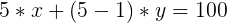
Scroll the carousel (all hard-coded; yuk!) and apply a subtle blur to imply motion/speed. Equation for the carousel’s transitioning and delayed points in order to complete an entire animation (i.e. 100%):

where n is the number of slides, x is the percentage of the animation spent static, and y is the percentage of the animation spent animating.
This carousel has five panes, so:
To work out y if we know n and decide on a value for x:

If we choose that x equals 17.5 (i.e. a frame spends 17.5% of the animation’s total time not animating), and we know that n equals 5, then y = 3.125:

Static for 17.5%, transition for 3.125%, and so on, until we hit 100%.
If we were to choose that x equals 15, then we would find that y equals 6.25:

If y comes out as zero-or-below, it means the number we chose for x was too large: pick again.
N.B. We also include a halfway point in the middle of our transitioning frames to which we apply a subtle blur. This number is derived from:

where a is the frame in question (out of n frames). The halfway point between frames 3 and 4 is:

I’m pretty sure this is all a mess. To any kind person reading this who would be able to improve it, I would be very grateful if you would advise :)
And the result is:
@keyframes carousel {
  0% {
    transform: translate3d(0, 0, 0);
    filter: blur(0);
  }
  17.5% {
    transform: translate3d(0, 0, 0);
    filter: blur(0);
  }
  19.0625% {
    filter: blur(2px);
  }
  20.625% {
    transform: translate3d(-20%, 0, 0);
    filter: blur(0);
  }
  38.125% {
    transform: translate3d(-20%, 0, 0);
    filter: blur(0);
  }
  39.6875% {
    filter: blur(2px);
  }
  41.25% {
    transform: translate3d(-40%, 0, 0);
    filter: blur(0);
  }
  58.75% {
    transform: translate3d(-40%, 0, 0);
    filter: blur(0);
  }
  60.3125% {
    filter: blur(2px);
  }
  61.875% {
    transform: translate3d(-60%, 0, 0);
    filter: blur(0);
  }
  79.375% {
    transform: translate3d(-60%, 0, 0);
    filter: blur(0);
  }
  80.9375% {
    filter: blur(2px);
  }
  82.5% {
    transform: translate3d(-80%, 0, 0);
    filter: blur(0);
  }
  100% {
    transform: translate3d(-80%, 0, 0);
    filter: blur(0);
  }
}
Holy moly!
Cleaning the animation
Before even thinking about Sass, let’s lighten the animation a little bit. As we can see from the previous code block, some keyframes are identical. Let’s combine them to make the whole animation simpler:
@keyframes carousel {
  0%,
  17.5% {
    transform: translate3d(0, 0, 0);
    filter: blur(0);
  }

  19.0625% {
    filter: blur(2px);
  }

  20.625%,
  38.125% {
    transform: translate3d(-20%, 0, 0);
    filter: blur(0);
  }

  39.6875% {
    filter: blur(2px);
  }

  41.25%,
  58.75% {
    transform: translate3d(-40%, 0, 0);
    filter: blur(0);
  }

  60.3125% {
    filter: blur(2px);
  }

  61.875%,
  79.375% {
    transform: translate3d(-60%, 0, 0);
    filter: blur(0);
  }

  80.9375% {
    filter: blur(2px);
  }

  82.5%,
  100% {
    transform: translate3d(-80%, 0, 0);
    filter: blur(0);
  }
}
Fine! That’s less code to output.
Bringing Sass in the game
Keyframes are typically the kind of things you can optimize. Because they are heavily bound to numbers and loop iterations, it is usually quite easy to generate a repetitive @keyframes animation with a loop. Let’s try that, shall we?
First, bring the basics. For sake of consistency, I kept Harry’s variable names: n, x and y. Let’s not forget their meaning:
$nis the number of frames in the animation$xis the percentage of the animation spent static for each frame. Logic wants it to be less than100% / $nthen.$yis the percentage of the animation spent animation for each frame.
$n: 5;
$x: 17.5%;
$y: (100% - $n * $x) / ($n - 1);
Now, we need to open the @keyframes directive, then a loop.
@keyframes carousel {
  @for $i from 0 to $n {
    // 0, 1, 2, 3, 4
    // Sass Magic
  }
}
Inside the loop, we will use Harry’s formulas to compute each pair of identical keyframes (for instance, 41.25% and 58.75%):
$current-frame: ($i * $x) + ($i * $y);
$next-frame: (($i + 1) * $x) + ($i + $y);
Note: braces are completely optional here, we just use them to keep things clean.
And now, we use those variables to generate a keyframe inside the loop. Let’s not forget to interpolate them so they are correctly output in the resulting CSS (more informations about Sass interpolation on Tuts+).
#{$current-frame,
$next-frame} {
  transform: translateX($i * -100% / $frames);
  filter: blur(0);
}
Quite simple, isn’t it? For the first loop run, this would output:
0%,
17.5% {
  transform: translate3d(0%, 0, 0);
  filter: blur(0);
}
All we have left is outputing what Harry calls an halfway frame to add a little blur effect. Then again, we’ll use his formula to compute the keyframe selectors:
$halfway-frame: $i * ($x / 1%) + ($i - 1) * $y + ($y / 2);

#{$halfway-frame} {
  filter: blur(2px);
}
Oh-ho! We got an error here!
Invalid CSS after "": expected keyframes selector (e.g. 10%), was "-1.5625%"
As you can see, we end up with a negative keyframe selector. This is prohibited by the CSS specifications and Sass considers this a syntax error so we need to make sure this does not happen. Actually, it only happens when $i is 0, so basically on first loop run. An easy way to prevent this error from happening is to condition the output of this rule to the value of $i:
@if $i > 0 {
  #{$halfway-frame} {
    filter: blur(2px);
  }
}
Error gone, all good! So here is how our code looks so far:
$n: 5;
$x: 17.5%;
$y: (100% - $n * $x) / ($n - 1);

@keyframes carousel {
  @for $i from 0 to $n {
    $current-frame: ($i * $x) + ($i * $y);
    $next-frame: (($i + 1) * $x) + ($i + $y);

    #{$current-frame,
    $next-frame} {
      transform: translate3d($i * -100% / $frames, 0, 0);
    }

    $halfway-frame: $i * ($x / 1%) + ($i - 1) * $y + ($y / 2);

    @if $i > 0 {
      #{$halfway-frame} {
        filter: blur(2px);
      }
    }
  }
}
Pushing things further with a mixin
So far so good? It works pretty well in automating Harry’s code so he does not have to compute everything from scratch again if he ever wants to display —let’s say— 4 slides instead of 5, or wants the animation to be quicker or longer.
But we are basically polluting the global scope with our variables. Also, if he needs another carousel animation elsewhere, we will need to find other variable names, and copy the whole content of the animation into the new one. That’s definitely not ideal.
So we have variables and possible duplicated content: perfect case for a mixin! In order to make things easier to understand, we will replace those one-letter variable names with actual words if you don’t mind:
$nbecomes$frames$xbecomes$static$ybecomes$animating
Also, because a mixin can be called several times with different arguments, we should make sure it outputs different animations. For this, we need to add a 3rd parameter: the animation name.
@mixin carousel-animation($frames, $static, $name: 'carousel') {
  $animating: (100% - $frames * $static) / ($frames - 1);

  // Moar Sass
}
Since it is now a mixin, it can be called from several places: probably the root level, but there is nothing preventing us from including it from within a selector. Because @-directives need to be stand at root level in CSS, we’ll use @at-root from Sass to make sure the animation gets output at root level.
@mixin carousel-animation($frames, $static, $name: 'carousel') {
  $animating: (100% - $frames * $static) / ($frames - 1);

  @at-root {
    @keyframes #{$name} {
      // Animation logic here
    }
  }
}
Rest is pretty much the same. Calling it is quite easy now:
@include carousel-animation(
    $frames: 5,
    $static: 17.5%
  );
Resulting in:
@keyframes carousel {
  0%,
  17.5% {
    transform: translateX(0%);
    filter: blur(0);
  }
  19.0625% {
    filter: blur(2px);
  }
  20.625%,
  38.125% {
    transform: translateX(-20%);
    filter: blur(0);
  }
  39.6875% {
    filter: blur(2px);
  }
  41.25%,
  58.75% {
    transform: translateX(-40%);
    filter: blur(0);
  }
  60.3125% {
    filter: blur(2px);
  }
  61.875%,
  79.375% {
    transform: translateX(-60%);
    filter: blur(0);
  }
  80.9375% {
    filter: blur(2px);
  }
  82.5%,
  100% {
    transform: translateX(-80%);
    filter: blur(0);
  }
}
Mission accomplished! And if we want another animation for the contact page for instance:
@include carousel-animation(
    $name: 'carousel-contact',
    $frames: 3,
    $static: 20%
  );
Pretty neat, heh?
Final thoughts
That’s pretty much it. While Harry’s initial code is easier to read for the human eye, it’s really not ideal when it comes to maintenance. That’s where Sass can comes in handy, automating the whole thing with calculations and loops. It does make the code a little more complex, but it also makes it easier to maintain and update for future use cases.
You can play with the code on SassMeister: